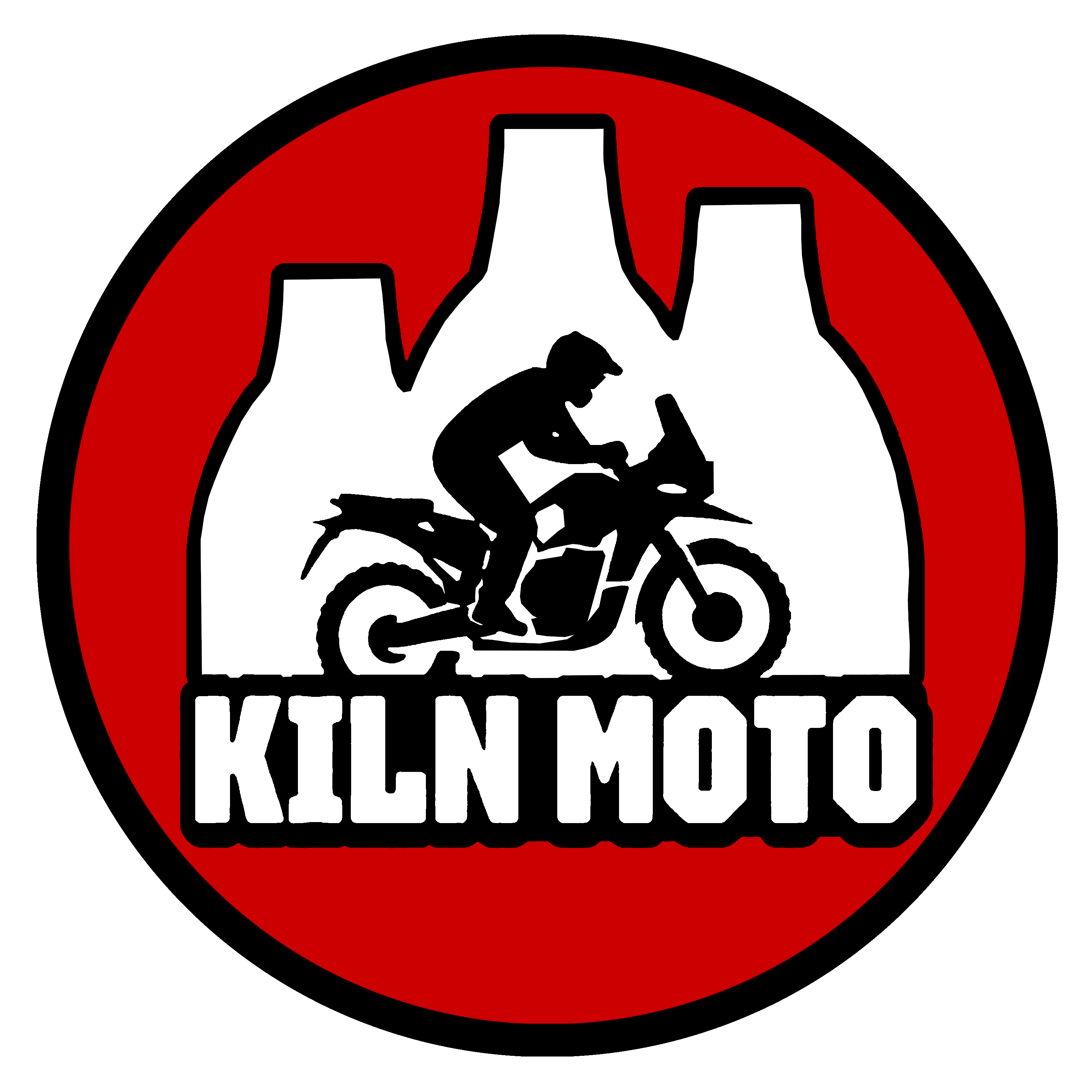
I recently made the decision to refresh my logo with a new design – it just felt like the right moment for a change. The previous logo had been with me for a long time, but as I’ve continued creating and gained a clearer understanding of what my content truly represents, I began to feel it like it needed a update. From a design standpoint, the original was something I put together fairly quickly, so it lacked refinement and didn’t always adapt well across different platforms or colour palettes. Although I made small updates along the way, this latest version offers far more flexibility and a stronger sense of identity.


I wanted something simpler and more flexible – a logo that works across videos, social media and other digital spaces without feeling cluttered. I also wanted to unify the font with the one used on the titles of my website.
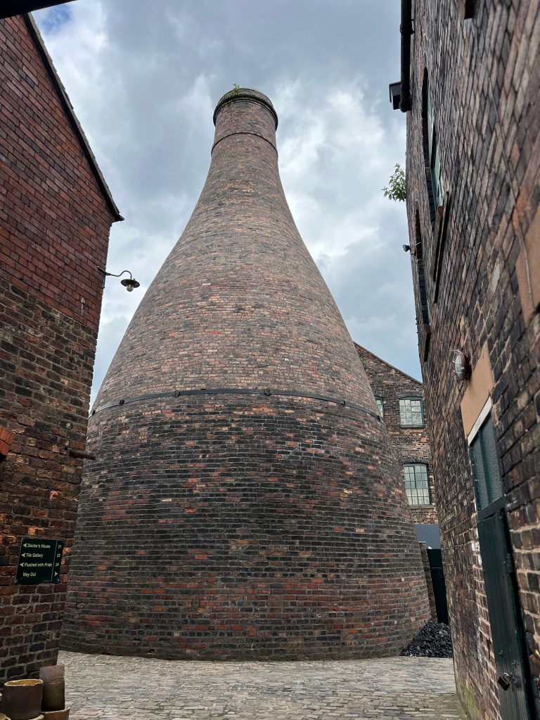
This is just another small step forward as I continue learning and building things as I go. The new logo feels more honest and features imagery that matters to me – a series of pottery kilns and an adventure motorbike. The inspiration came from one of my regular photo spots, Gladstone Pottery Museum, a place that’s had a quiet influence on my creativity.

Overall, the update reflects a clearer vision, a more focused direction, and branding I’m hoping to develop over time.

Leave a Reply